
Squaring Price & Time
#296 Happy Easter and an update on the DJIA following major cycles

Introduction
Happy Easter! I hope you enjoy a wonderful time with your family and friends. Although most markets around the world are closed for a few days, I have updated last week’s DJIA chart to reflect on important long-term and short-term cycles. In this post, we will take a fresh look at how to align Price and Time from a geometric perspective.

On March 30th, the US Indices squared out in Price & Time. Where Price and Time align, or are at equilibrium, a change in trend may occur. In this post, I will show how a circle around key waves can be useful in identifying potential inflection points or trend changes.
First, let us look at the 60- and 4-year cycle updates for the DJIA.
DJIA - The 60-year Cycle & Planetary Time Clusters
New readers may want to read my previous post first. You can find it here and here.
The DJIA is continuing its course like clockwork following the 4-year and 60-year cycles.
In the updated chart below, based on last week’s chart, I have plotted the cumulative hard aspects (0, 90, 180 degrees) of planetary transits and included planetary geometries. This illustrates the Time Cycle Clusters at the bottom of the chart, where the highest volatility and market activity are expected. I have added a green overlay of a 60-year cycle.
The 60-year cycle forecast has been updated from April 1st, 2026, onwards.
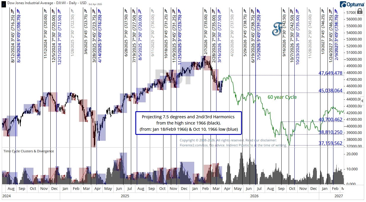
So far, the DJIA continues to follow this same pattern as seen 60 years ago. Even after 60 years, there is an interesting similarity between the 1966 and 2026 inflection points.
Zooming in on the same chart and time clusters, you can see that an increase in Time Clusters, hard planetary aspects, often causes a decrease in price over time. A decrease in time clusters may often cause an increase in Price.
Based on the cluster of various cycles I mentioned over the past few weeks, I forecasted that the decline might continue into the latter part of March. Since cycles can still influence events even after reaching a certain (hard) aspect, I expect it to last until the end of March. On the chart, you can see a decrease in hard aspects around Easter, followed by a slight recovery. After Easter, I anticipate the hard aspects will increase again.
Due to the recent panic over the Oil Crisis in Iran and fears that inflation and rising interest rates may return, the downtrend has been more volatile than it was 60 years ago.
DJIA - 4-year Cycle
The chart I showed you earlier displays the long-term trend from March 2020 onwards. The mid-March low was similar in price and time to that of 4 years ago. I have plotted the 4-year analog in dotted black on the chart to remind ourselves that what happened 4 years ago may happen again.
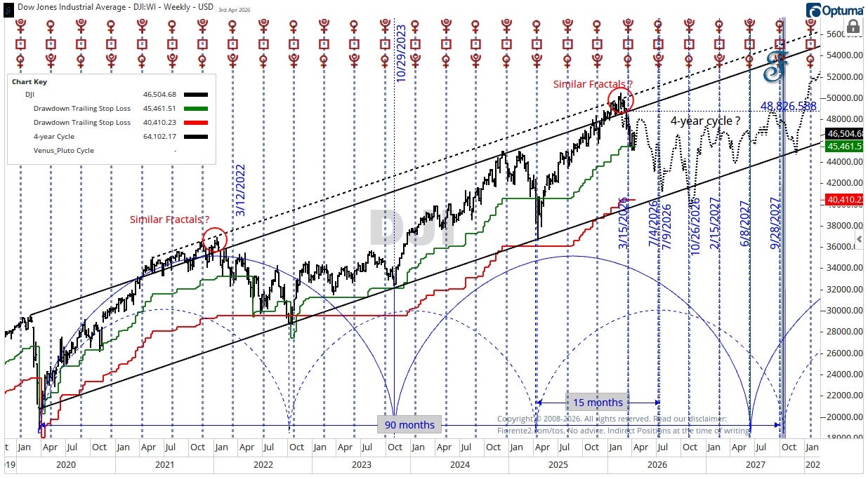
The DJIA recently found support at a 10% decline from its February 2026 peak. If the downtrend continues and falls below this level (indicated in green on the chart), we may see a decline of around 20% from the peak, which corresponds to the lower trend channel line.
The importance of a Circle
In this post, I would like to show you how a circle around a key high-to-low wave can forecast the next inflection point.
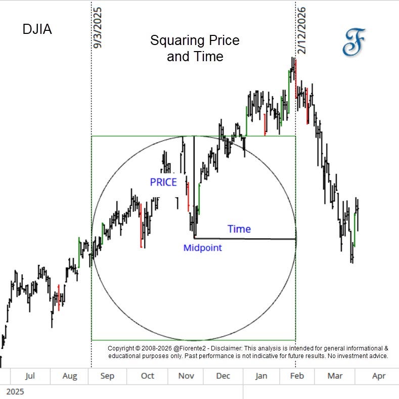
In the chart above, for example, I have drawn a circle from the midpoint to the top of the previous high. That radius, or price vector, is equal in length to the horizontal radius or the duration in time. The ratio of time to price suggests a high in February 2026, with the circle ending on the right edge. This is a geometric way of squaring Price with Time.
As you can draw a square around the circle, it is obvious what W.D. Gann might have meant by squaring Price and Time in using a circle. 1
Think of the circle as a way of linking price and time. If you start from an important low or midpoint and draw the circle up to the previous high or next major high, that radius is not just a price distance — it’s also the cycle’s time measure.
In the next examples, I will use the Dow Jones Industrial Average E-mini Futures Contract (YMSpot). I posted one of the charts below earlier this week in this Substack note.
How to identify important trend changes
First, where should we start to draw important circles to forecast the next inflection points?
In identifying significant trend changes where the next cycle waves may start, one can usually find them easily by looking at big bars. Those are usually the bars that exceed a 50-day average true range of 1 Bar ATR and close in the upper/lower part of a bar. 2
These bars are plotted on the chart below in Red and Green. Big bars will likely tell you something is happening in the market. You can see how easily you can use the ATR as a measure of where important trend changes or trend continuations may occur.
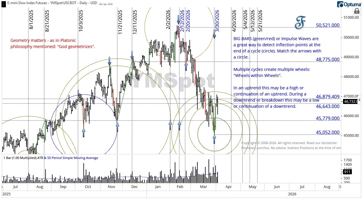
Note that the cycle at the top of the chart is based on the seed cycle in blue (midpoint at 10/3/2025) that locked the price/time ratio of the chart. This Price and Time ratio, the chart is set to may work for quite some time in the future.
Each cycle drawn on the chart, in the past or future, is just a harmonic cycle around important waves that follow the same price/time ratio as the seed cycle. Follow the arrows around the circles drawn and see how they forecast the next inflection point.
In the chart below, I have highlighted in blue the circle around the first impulsive wave from the crest, which started on February 12th and ended on February 20th, 2026. You can see that the radius of the circle is the move in price, which can be expressed in time or seen as the duration of the cycle.
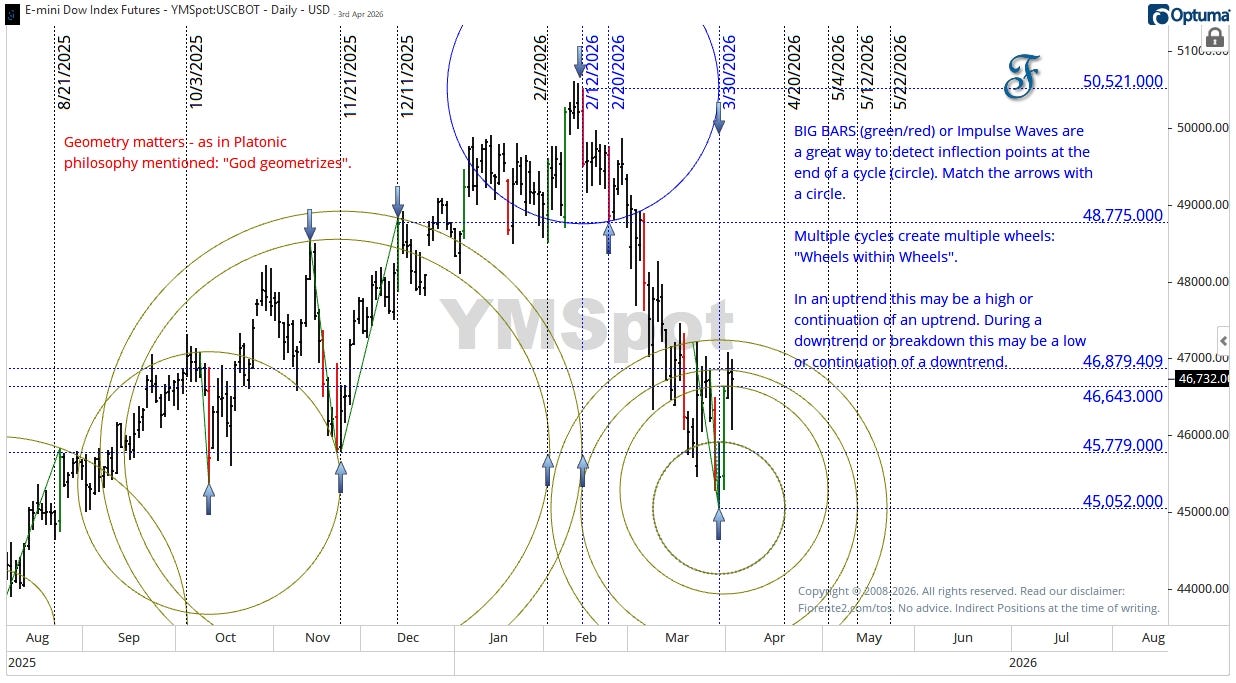
This cycle ended precisely on the day that the Dow Index E-mini Futures made a low on March 30th, as price and time are equivalent. Price and Time were squared on that day. Hence, a change in trend may occur.
The next inflection point(s)
On the low of March 30th, 2026, where price and time were squared, I have drawn various circles around waves or bars that may indicate where the next inflection points could be found. Note: on a daily chart, a cycle can be as small as 1 daily bar.
In an uptrend, the end (right side) of a circle often signals that the uptrend may continue or points to the next potential high. In a downtrend, this may indicate either an important low or the continuation of the downtrend.
Multiple cycles create multiple waves: “Wheels within Wheels”.
An important stock market dip with some volatility in the following days often triggers multiple waves that investors react to. This effect might last for a while before it diminishes.
An important stock market dip is like throwing a stone into water, creating ripples that continue until the water settles. You can clearly see the ripple effect around the low of March 30th, 2026, when defining smaller and larger cycles around that day.
Hence, based on this analysis, the next trend change could occur as early as mid-April or as late as Mid-May 2026 before we can see a clear direction the market will take. Perhaps in Elliott Wave terms, we are now just in an Elliott Wave 4 of some degree.
Conclusion
I will not make a summary conclusion of today’s post. I let the charts speak for themselves.
The financial markets are highly volatile right now, and this may continue for a while, as there is no clear path to the end of the war in Iran. At times like this, I stay out of the markets and will see what happens. When volatility subsides, we may see some good opportunities to take new positions.
Remember, cycles can contract, extend, and invert. I may be wrong, of course. Anomalies can occur, fundamentals can shift, so be cautious. I expect some significant volatility ahead.
As there is always a lot to cover in financial markets, I sometimes make a quick note here on Substack, which lets me spend more time on research rather than writing a lengthy article.
Make sure you have notifications turned on in the web browser or the app to receive a quick post as a note. If you don’t know how to do that, please visit the Substack help files or ask Google Gemini.
As I am enjoying a long weekend around Easter, I am unable to respond to your questions or remarks. Feel free to join the chat group I recently created so I can address your questions when I return to the office on Tuesday. You can find it here (click on the link).
In case you haven’t noticed, I post various charts in the Substack notes every week. You can find them all here. (click on the link)
P.S.: Occasionally, I share new analyses exclusively for free subscribers. Subscribing gives you email updates on these posts, plus extra insights and deeper research from the time you join onward; past analyses are not included.
If you liked this post from @Fiorente2’s Blog, why not restack and share it?
© 2008–2026 Fiorente2.com. All Rights Reserved.
Disclaimer: This analysis is for informational and educational purposes only and should not be considered investment advice. Read our full disclaimer.
Disclosure: From time to time, I may hold positions in the securities mentioned.
Here, I followed one of Michael S. Jenkins’ interpretations in Squaring Price and Time from a geometric perspective
This is based on the original idea of Michael S. Jenkins