
A revisit to recent charts and analysis
#294 Update on the DJIA, Crude Oil, Gold and Silver

Introduction
The financial markets have recently been highly volatile. This may persist amid the uncertainty of the Iran conflict. In my latest post, I analyze the DJIA, crude oil, gold, and silver charts, offering updates on both short- and long-term trends.
At times like this, I stay out of the markets and will see what happens. When volatility subsides, we may see some good opportunities to take new positions.
New subscribers might find it helpful to revisit my older posts on my Substack homepage.
DJIA - The 60-year Cycle & Planetary Time Clusters
The 60-year nominal cycle, based on 3 times the approximate 20-year Jupiter-Saturn cycle, struck again and tumbled down last week from the 60-year high, on the same day of the month as 60 years ago. It may not be a coincidence, as many cycles return to the same zodiac part every 60-years, but it is never an exact copy of past cycle advances or declines.
On a monthly chart, as shown here and made with Timing Solution software, the correlation over a very long time is good. You can see that, from time to time, although the overall direction is clear, this cycle may experience periods of lower correlation or even inversion. Other cycles may be more dominant around these times. Below is the updated chart from a post (note/tweet) a few days ago.
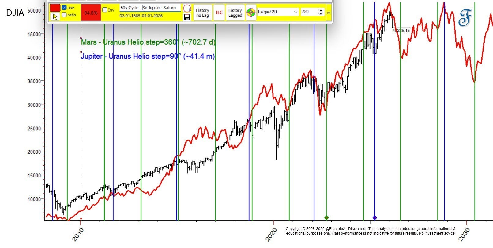
The high fit over the last 5 years is remarkable, and if this cycle continues, it will take years for the DJIA to surpass the recent all-time high.
The cycle lines on the chart are from Mars-Uranus, and Jupiter-Uranus Helio, and past throughs did have a good fit with these cycles. They may align with the potential future troughs of the 60-year cycle plotted in red.
Note: Time is more important than Price, hence the inflection points at the troughs and crests are more important than the price forecast.
Does the recent decline align with todays planetary constellations, transits, and geometries?
In the updated chart below, based on last week’s chart, I have plotted the cumulative hard aspects (0, 90, 180 degrees) of planetary transits and included planetary geometries. This illustrates the Time Cycle Clusters at the bottom of the chart, where the highest volatility and market activity are expected.
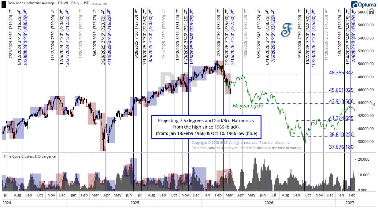
I have plotted the 60-year cycle from the same calendar day as 60 years ago (February 9th) in green, and we may be close to an inflection point, provided the DJIA continues to follow this same pattern as seen 60 years ago. Even after 60 years, there is an interesting similarity between the 1966 and 2026 inflection points.
Zooming in on the same chart and time clusters, you can see that an increase in Time Clusters, hard planetary aspects, often causes a decrease in price over time. A decrease in time clusters may often cause an increase in Price.
Based on the cluster of various cycles I mentioned last week, I expected the decline could continue into the latter part of March. As cycles continue to influence even after reaching a certain (hard) aspect, this could extend into the end of March. On the chart, we may soon enter a short period into April (Easter?) when we can expect a slight recovery. After Easter, I see the hard aspects increasing again.
Due to the recent panic over the Oil Crisis in Iran and fears that inflation and rising interest rates may return, the downtrend has been more volatile than it was 60 years ago. This may persist if the crisis continues, and the projected rebound in April may not recur as seen in 1966.
Crude Oil
The war in Iran has stirred up the energy market quite a bit. I had been following cycles of Jupiter, Saturn, Pluto, and Mars over the last two years. Still, I could never have believed that during this time the market would shoot up like a rocket, as it did, and then hurry back in a mirror-image reverse to the angle Jupiter and Saturn were on almost 12 years ago.
A few days ago, I posted the chart below to explain what was happening. You can find the chart here:
You can click on the chart above for more details (in your app or web browser).
Basically, this chart tells you that the Jupiter-Saturn and Jupiter-Pluto cycles have reversed their course from the midpoint, and Jupiter-Saturn may reach a similar high as it did almost 12 years ago by April 2026. If the mirror-image foldback continues, the plotted dashed line may suggest that the energy crisis could affect prices for many years before we return to normal oil prices of around $60 or lower
GOLD
It is no coincidence that Gold reached a high by the end of January 2026. A 49-year cycle was due to expire. Hereafter, inflation fears gripped investors, prompting a sell-off across many asset classes.
I explained this in a tweet or a Substack note back in January (click on the link).
In short, that January chart shows that $Gold Futures reached a channel top from the 1980 high, 45 years ago, and 90 months after the 2018 low. Expecting resistance in the coming weeks at Mars-Pluto conj. (Helio) around the 618% Fib ext. level.
Like Silver, Gold could continue to June 2027 when Jupiter aligns with the 1980 high. You can see in the chart below that, following the Mars-Pluto Helio cycle, a further short-term decline may be expected, at least to the dotted-dashed line or the bold Saturn 1x2 timing line.
Continuing a decline to a 4-year cycle low by August/September 2026 is a likely scenario.
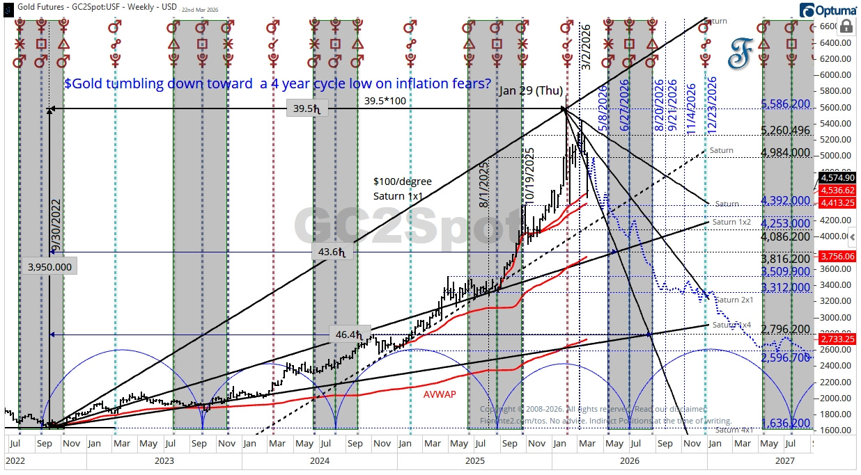
A decline below $4,392 might trigger a decline towards lower levels. For now, Gold may have found support at the VWAP (Volume Weighted Average Price) level in red. Note that the other VWAP levels align with the Saturn Timing lines in solid black.
Silver
Silver and Gold often move together. Hence, a similar high around the same date. Back on January 22nd, 2026, I posted a long-term chart to show you the basic resistance from the 1980 high (from zero points), hinting Silver could find resistance around the $119 level by the end of January, and it did.
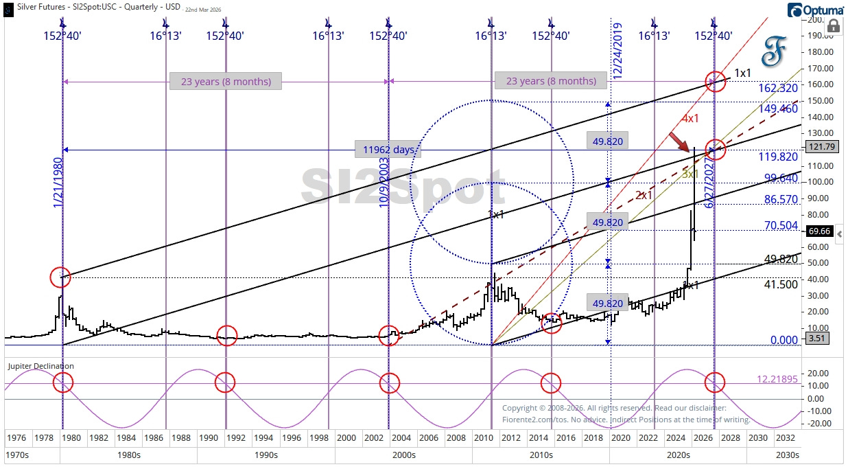
You can see in the above chart that Silver hit the 1980 timing line from the zero point.
Often, a stock, index, or commodity reverses polarity once it reaches the same planetary angle the next time, often in a low-to-high or high-to-low sequence. This is why I expect the surge uptrend in Silver may not be over, but a low-to-low sequence is also possible. A recession and lower demand for Silver may cause Silver to trade at a low by June 2027, rather than at an expected high.
On the updated Daily Chart below, I have drawn a large circle around the end-of-January decline. A big drop like that is a cycle in itself. This may indicate that the recent tumble could continue until the end of this cycle (circle), by mid-April to early May.
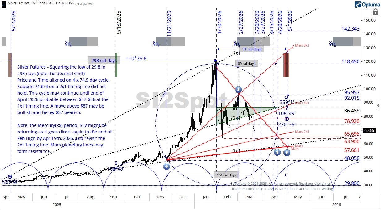
Timing lines from Mars (red) may align with these dates, and can offer support and resistance. As Mercury is going direct again, one may expect some recovery until Easter, but I do not expect it to be as high as on February 27th, 2026. More commentary can be found on the chart.
Conclusion
I will not make a summary conclusion of today’s post. I let the charts speak for themselves.
The financial markets are highly volatile right now, and this may continue for a while, as there is no clear path to the end of the war in Iran. At times like this, I stay out of the markets and will see what happens. When volatility subsides, we may see some good opportunities to take new positions.
Remember, cycles can contract, extend, and invert. I may be wrong, of course. Anomalies can occur, fundamentals can shift, so be cautious. I expect some significant volatility ahead.
As there is always a lot to cover in financial markets, I sometimes make a quick note here on Substack, which lets me spend more time on research rather than writing a lengthy article.
Make sure you have notifications turned on in the web browser or the app to be notified of a quick post as a note. If you don’t know how to do that, please visit the Substack help files or ask Google Gemini.
In case you haven’t noticed, I post various charts in the Substack notes every week. You can find them all here. (click on the link)
P.S.: Occasionally, I share new analyses exclusively for free subscribers. Subscribing gives you email updates on these posts, plus extra insights and deeper research from the time you join onward; past analyses are not included.
If you liked this post from @Fiorente2’s Blog, why not restack and share it?
© 2008–2026 Fiorente2.com. All Rights Reserved.
Disclaimer: This analysis is for informational and educational purposes only and should not be considered investment advice. Read our full disclaimer.
Disclosure: From time to time, I may hold positions in the securities mentioned.